Sunday, September 28, 2008
Thursday, September 25, 2008
Object & Audience
 I chose a old CB radio for my object. The audience that would be interested in this type of radio would be small trade businesses, truck drivers, radio hobbyists and anyone interested in different forms of communication. They were probably introduced to this device through their job or through someone who is a radio hobbyist. People use these radios as a means of communication. Throughout the 1970s and early 1980s, a phenomenon developed over CB radios. Similar to internet chat rooms, the CB allowed people to get to know one another in a quasi-anonymous manner. Many movies and stories about CBers and the culture on-the-air developed. People might want to see an exhibit about this object because a lot of people grew up using this object and still use them today.
Monday, September 22, 2008
Voting Poster Statement
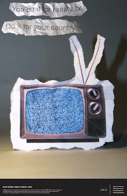
I created a series of posters to appeal to youth voters. I chose to use cut paper to create my images because I thought this would be an aesthetic that would appeal to my audience. I chose to use parody in my first poster. I achieved this by taking a familiar slogan, changing it slightly and adding voting imagery. I also added random objects to play on the fact that voting is a vary private process. For my next poster I chose use reality TV as a metaphor for the voting process. I used a TV with a distorted image to allude to a politician or reality TV judge. The date on the TV alludes to the voting process of reality TV.
Junior Crit.
In my crit. with Josh we talked about changing the font and moving it to give it a better flow.
We also talked about how the piece with just one guy in it needed more to get the concept across.
We discussed how the size of the voting booth image needs to be reduced so that it fits composition as well.
Friday, September 19, 2008
Sunday, September 14, 2008
Friday, September 12, 2008
Monday, September 8, 2008
Friday, September 5, 2008
Thursday, September 4, 2008
multimedia project 1 new solution
 For this solution I cut down the size of the articles. I also added navigation so that the user can personalize the stories stories they receive as well as the look. The user can also rate and share articles with other users. For the header I used the same color as the LA Times but, I put the text on an angle and added some texture.
Tuesday, September 2, 2008
Multimedia project 1
The audience I chose for my project is urban professionals who are single, interested in art and like the night life.
Multimedia project 1 solution 1
 This design was influenced by a motion graphic I saw for the LA Times. I chose to use it on top instead of their other logo. I tried to use the reflection and shadow in my titles but could not get it to look right. Instead I chose to crop the photos at an angle to add interest. I wanted to reference the print medium so I placed the text in columns.
Multimedia project 1 solution 2
Multimedia project 1 solution 3

For this solution I wanted to reference the print medium. I wanted to play off the idea of tearing
out a particular article that you might like to hang up. I let this idea influence my design by using torn paper behind the articles. For a background I chose crumpled news paper to further reference the original medium of these articles.
Subscribe to:
Comments (Atom)


